What Is the Trend Color for 2014
Designers Take a Modern Twist on the Traditional to Create a Colorful Equilibrium
Pantone LLC, the global authority on color and provider of professional color standards for the design industries, unveiled the PANTONE® Fashion Color Report Spring 2014, a comprehensive overview of designers' use of color in their upcoming collections.
Released on the first day of New York Fashion Week, the PANTONE Fashion Color Report features the top 10 colors for women's and men's fashion for spring 2014, along with designer sketches, quotes and headshots.
The report is available for free download at:www.pantone.com/spring2014
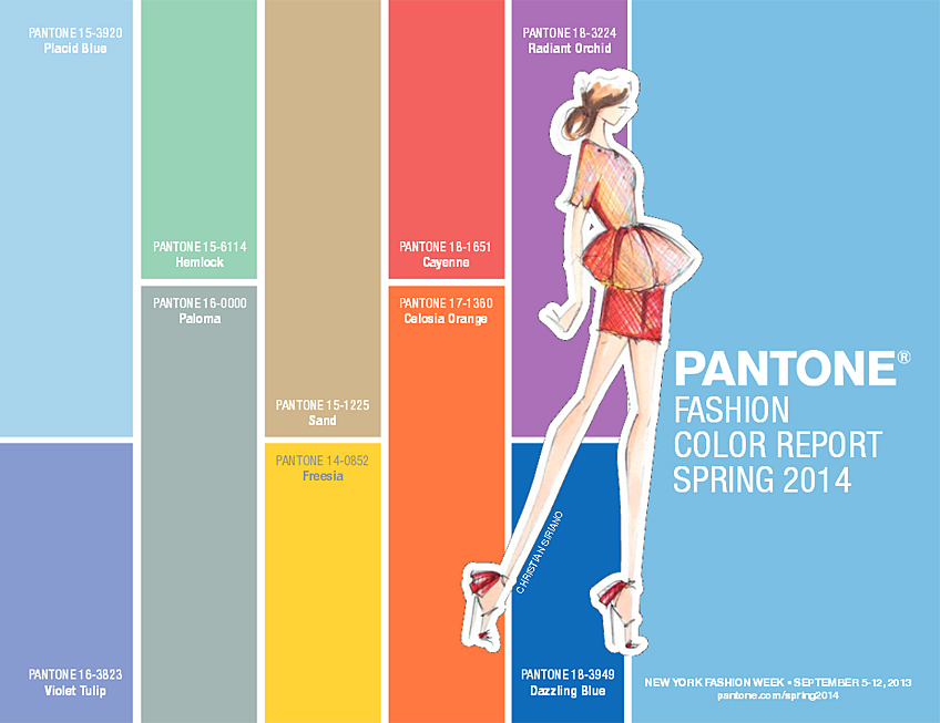
Pantone Fashion Color Report Spring 2014
"This season, consumers are looking for a state of thoughtful, emotional and artistic equilibrium,"said Leatrice Eiseman, executive director of the Pantone Color Institute®.
"While this need for stability is reflected in the composition of the palette, the inherent versatility of the individual colors allows for experimentation with new looks and color combinations."
The Top Colors for Women's Fashion for Spring 2014 Are:
PANTONE 15-3920 Placid Blue
PANTONE 16-3823 Violet Tulip
PANTONE 15-6114 Hemlock
PANTONE 16-0000 Paloma
PANTONE 15-1225 Sand
PANTONE 14-0852 Freesia
PANTONE 18-1651 Cayenne
PANTONE 17-1360 Celosia Orange
PANTONE 18-3224 Radiant Orchid
PANTONE 18-3949 Dazzling Blue
The Top Colors for Men's Fashion for Spring 2014 Are:

Pantone Fashion Color Report Spring 2014
PANTONE 15-3920 Placid Blue
PANTONE 18-3718 Purple Haze
PANTONE 18-6216 Comfrey
PANTONE 16-0000 Paloma
PANTONE 15-1225 Sand
PANTONE 14-0852 Freesia
PANTONE 18-1651 Cayenne
PANTONE 17-1360 Celosia Orange
PANTONE 19-2428 Magenta Purple
PANTONE 18-3949 Dazzling Blue
Women's Color Palette
Designers take a modern twist on the traditional for spring 2014 by pairing soft pastels with vivid brights to create a colorful equilibrium. Inspired by a mixture of blooming flowers, travels abroad, and strong, confident women, designers use color to refresh, revive and defy conventional wisdom.
Three very adaptable pastels sit on one end of the palette, and, because we are so accustomed to seeing them as nature's background, they can be creatively combined with any other color in the spectrum.
Placid Blue, like a picture-perfect, tranquil and reassuring sky, induces a sense of peaceful calmness, whileViolet Tulip, a romantic, vintage purple, evokes wistful nostalgia.
Similar to the verdant shade of springtime foliage,Hemlock, a summery, ornamental green, provides a decorative touch that's very different from the greens of recent seasons. Pair any of these versatile pastels with a bolder hue for an au courant look.
Sand, a lightly toasted and amiable neutral, conjures images of the beach and the carefree days of summer. Try pairingSand withHemlock for perfect, natural balance.Paloma serves as a quintessential neutral, interesting enough to be worn alone or combined with any color for sophisticated poise.
Cayenne, a high-pitched red, adds a dash of spicy heat to neutrals, and heightens the excitement when mixed withFreesia, a blazing yellow that is sure to illuminate wardrobes this season.
A tropical, floral-inspired shade,Freesia's warmth and energy help set the stage forCelosia Orange, an optimistic, spontaneous hue. PairCelosia Orange withViolet Tulip for a captivating vision, much like the setting summer sun.
The palette is brought full circle withRadiant Orchid, a bold counterpart toViolet Tulip, andDazzling Blue, a scintillating, polar opposite toPlacid Blue.
Surprisingly, these strong, vibrant colors also pair well across the palette: They are perfect companions to pastels, and add confidence and vivacity when mixed with other bold colors.
Men's Color Palette
Light and airyPlacid Blueis a perfect background color for spring, offering another alternative to the classic neutrals. Pair it withComfrey, a more masculine take on the softer Hemlock green from the women's palette, to create a fresh, seasonally inspired look.
For a modernized vintage feel, pairPurple Haze, a deeper, stronger version ofViolet Tulip, withPaloma, a confident and adaptable gray.Sand, a warm, agreeable neutral, can be coupled with more daring colors in the palette – making them less intimidating.
Both Paloma and Sand are perfect complements to fieryCayenne red, and help harness the powerful energy that intenseFreesia yellow brings to the spectrum. Accessories, including shoes, in bold colors, likeCayenne,Freesia andCelosia Orange, are becoming more popular for men this season, adding a touch of gusto to neutral formal attire.
As the temperatures rise, we are also seeing a lot of vibrant patterning that combines bold and tropical colors in many sectors of menswear. Create a magnetic look by mixingMagenta Purple, a more robust version ofRadiant Orchid, with the higher voltage colors in the palette, likeCelosia Orange andDazzling Blue. These three energetic yet versatile hues are sure to be a hit in spring 2014.
The colors featured in the PANTONE Fashion Color Report are culled from the PANTONE FASHION + HOME Color System, the most widely used and recognized color standards system in the world. Each season, Pantone surveys the designers of New York Fashion Week and beyond to collect feedback on prominent collection colors, color inspiration and color philosophy. This information is used to create the PANTONE Fashion Color Report, which serves as a reference tool throughout the year for fashion enthusiasts, reporters and retailers.
Pantone
Pantone LLC, a wholly owned subsidiary of X-Rite, Incorporated, is the world's color authority, providing design professionals with products and services for the colorful exploration and expression of creativity. This year, Pantone celebrates its 50th anniversary. Always a source for color inspiration, Pantone also offers paint and designer-inspired products and services for consumers.
More information is available atwww.pantone.com. For the latest news, trends, information and conversations, connect with Pantone onFacebook,Twitter,Pinterest andInstagram.
Tags: 2014, Color, color trends, ColoroftheYear, COY, fashion, Mega Trends, Pantone, trends
What Is the Trend Color for 2014
Source: https://www.fashiontrendsetter.com/v2/2013/09/06/pantone-fashion-color-report-spring-2014/
0 Response to "What Is the Trend Color for 2014"
Post a Comment